I analysed the front cover of our magazine to show the common magazine conventions that had been used. The analysis clearly shows that most of the magazine conventions have been used.
Monday, 14 February 2011
Thursday, 10 February 2011
Final Magazine Version 1
We decided to make some further changes to the magazine cover as we believed that the magazine was still not up to standards and required some essential changes. Firstly we changed the caption at the top ' 2011 introduces your new fear' to 'new year new fear.' We then added in the circle ' Ayesha Seuenos talks exclusively to Empire about why those who get high always die' we used this as a method to attract readers to the magazine. We also changed ' Take a look into this years number one horror' to ' take a look into this years no 1 horror.'
Final Poster Version 2
We did not feel that the poster had been completed fully and there was something missing, as we had a lot of black empty space. We needed another link between our poster and trailer and therefore came to the decision to add a flame, which is seen at the end or our trailer, to our poster too. This was the FINAL version!
Poster Final Version 1
We changed the names in this as we added our own names and the characters names that acted in the trailer. This was our final film poster that we had edited again and finalised.
Planning of poster
I created a rough design on the poster, and planned what it would look like. I created names that would be included on the poster and any other important information that needed to be included. 
Empire Film Magazine Analysis
I did a detailed analysis of an Empire film magazine to analyse the common conventions in the magazine. I higlighted the conventions so I could be aware of them in the future and use them in my magazine cover.
Quarantine Dragging Scene

We decided to use the dragging scene used in the film Quarantine in our horror trailer. We used a low angle shot, and our final girl was dragged behind by an unknown force.
Definition of Intrude
1. Put oneself deliberately into a place or situation where one is unwelcome or uninvited
he had no right to intrude into their lives
she felt awkward at intruding on private grief
2. Enter with disruptive or adverse effect
politics quickly intrude into the booklet
3. Introduce into a situation with disruptive or adverse effect
to intrude political criteria into military decisions risks reducing efficiency
4. (of igneous rock) Be forced or thrust into (a preexisting formation)
the granite may have intruded these rock layers
5. Force or thrust (igneous rock) into a preexisting formation
From the worldwide bestseller
© 2011 Kill Ville Productions. All rights reserved.
The film title links in with our trailer, as the characters intrude into someone else's house, where they are attacked by an unknown force.
Common Conventions of a Magazine Cover
Masthead
Barcode
Price
Date
Main Image of a leading actor
Tagline
Included Features
Title of main article
This conventions should be inlcuded in the magazine to make it look realistic.
Construction of Film Poster
Colour change on poster
View more presentations from MRSmedia.
We had to change the colour of the hand so it fit in with the magazine cover and created a link between the two. It shows that the red hand is trying to unmask the villain.
Monday, 7 February 2011
Locations and Villain
We used various different locations to film our trailer:
Ruksana's bedroom
Park
School
Drama studio
Media suite
Alley way
House in park
Our villain in the trailer is a masked figure behind a white mask.
Trailer Feedback; Youtube and Questionnaire


AUDIENCE
Asked 20 people
All females
Between ages of 15-18
[even though our actual target audience was 18-23 year olds, male and female]
Official Screening and Invite


These were the final invites and poster designed for the official screening of the trailer.
Wednesday, 2 February 2011
Final Magazine Poster Edited

We realised that our magazine and film poster did not have a direct link inbetween them. Therefore we had to go back and make changes to it so that they had a link. we changed the font of 'Intrude' so it matched the font on the film poster. We changed it from 'Intruder Alert' to 'Intrude Alert' as it had a double meaning and could mean that it was warning us that the film Intrude was intruding and also meant that there was an intruder intruding.
Titles
These titles were included in the trailer inbetween the different scenes, so that they trailer would make more sense and atrract the audience.
SOME SECRETS ARE BEST KEPT HIDDEN?
FROM THE AWARD WINNING DIRECTOR OF
APPARITION
HOW YOU COPE WHEN THINGS GO WRONG…
CAN BE A MATTER OF
THIS FEBRUARY…
Existing magazine cover analysis
Media magazine analysis
View more presentations from MRSmedia.
In order to gain an idea on how to construct our magazine cover to look as similar as possible to the Empire magazine, we decided to look at existing Empire magazines. By doing this we were able to understand the important conventions that were being displayed in Empire magazine and what sort of features we would need to include on our magazine cover. We looked at mumerous covers, for alll different genres and were able to gain an idea in the end.
Existing film poster analysis
We wanted to create a film poster as similar as possible to a real life poster that had been created. Therefore I undertook the task of researching existing film posters. I created a powerpoint with all the posters and then highlighted the main conventions on the horror posters. By doing this we became more aware of the things that were needed to be included on the poster. I realised that most posters were quite simple with a main backgroung image, the film title, and the cast list. Therefore we decided to work with the same conventions and keep the poster simple yet effective. Another member of the team and myself, created a sketch of the poster and where everything would be placed. This gave us an idea of where to place everything and made the construction on the poster easier. We went and took a tha picture we believed would suit the front cover. Another member of the team made the poster, whilst myself and my other team mate, gave constructive feedback and told the creator where to place certain things.
Existing film poster analysis
View more presentations from MRSmedia.
Tuesday, 1 February 2011
Snow Problems
We decided within our groups to start shooting as per planned, however due to heavy snowfall we were unable to do so. This meant that we had to change our entire shooting schedule so that we could use the new one to organise of filming. After the snow fall, we were due to shoot in the half term holidays. Again we faced another problem, as we had issues with meeting up with our actors as they were unavailable to shoot on the days available. Then one of our actors got shingles which meant that we had to work our way around it and continue shooting without her as we were already behind on our time schedule. It was a difficult job as it was necessay for our actor to be included, however by using various camera angles, we managed to shoot our scenes without her.
Final Magazine Cover
After intense research and look at exisiting magazine covers, we finally managed to put all our ideas together and create our final magazine cover, which we believe include all the essential magazine cover conventions. I drafted a rough sketch of what the magazine cover was to look like, so we had an idea of what the final product would look like. We looked at numerous Empire magazines and realised that most of them included a '+' which had an extra thing in the magazine that was to be looked out for. We decided to make this plus to be 101 pages of horror special, where the horror freaks can discover the history of horror and how it came about. We also used the convention of having the celebrity infront on the magazine title as it was a well estblished and known magazine. We decided to include the police tape with 'do not cross' behind the character as it related back to our film and the 'intruder alert' also relates back to the film as our film is called ' Intrude' and is based upon tresspassing on sealed off premises. On the right side of the magazine we added a list of famous directors and upcoming films included that were to be looked out for. Barcode, website and date have also be placed on the cover. The circle is used to attract the audiences attention as it lets them know that this edition in particular is a Horror Special. Due to have limiting Photoshop skills, I did some basic cutting around the images and placing images and writing on the magazine. However kept giving useful feedback and contributing many useful ideas.
Your Next...
After filming the falling down scene we moved onto the production and filming of 'Your Next.' We got a white cotton cloth on which we firstly rolled in mud to create a dirty effect and then used red paint to write the words 'Your Next.' Again we experimented with a variety of camera angles and different lightings in order to achieve the best results, that would make the scene look realisitic and scary. Mehreen's hand was used in the shot , whislt I took filmed. We tried ariels shots, over the shoulder shots and close up shots, till we fianally achieved what we wanted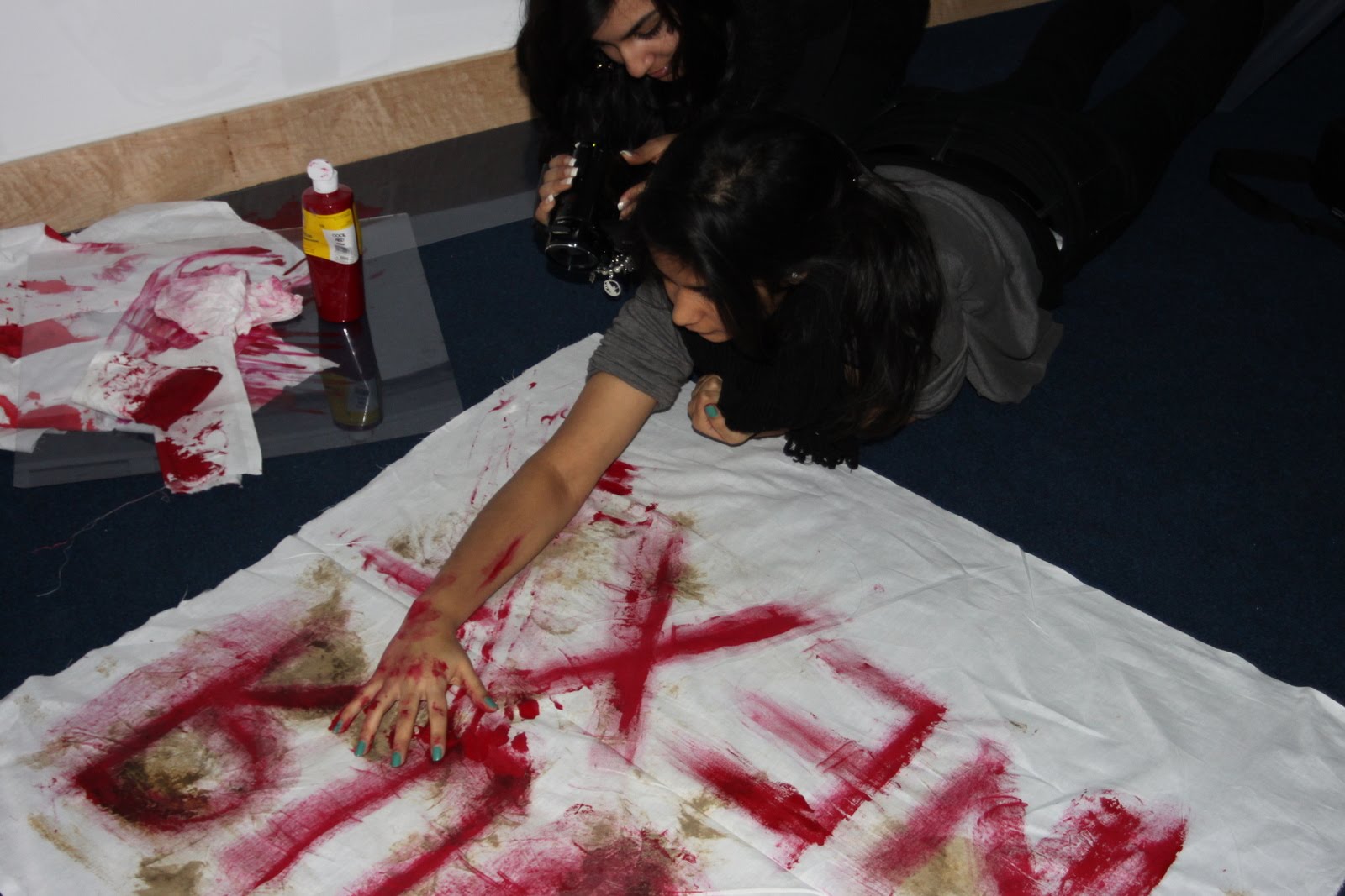


.
Falling down scene
We experimented with a range of camera angles and shots, in order to create a perfect, realistic shot that showed our main character falling to the floor.
It was a hard task to accomplish as we could not get the shot right. We tried over the shoulder shots, where myself being the tallest member of the group held the camera over the main characters shoulder, however this was unsuccessful. We all tried to film shoot this scene however we realised that it looked the best when the person falling down actually held the camera.
After alot of experimenting we managed to achieve the perfect shot needed for our trailer.
Myself and Ruksana edited the scene by gathering the variety of clips gathered and cut them and put them together to create the end results. We slowed down the pace of it and added a blur at the end for extra effect


Dead Bodies Scene

This was one of the shots that we filmed which was a possible scene to be included in our trailer. We got numerous students from college that wouldnt mind acting as dead bodies to lie down on the floor in the drama studio. I posed as one of the dead bodies too.
Make up for the dead bodies


To make our dead bodies seem more realistic we had make up done on them, to make them look like they had been severely bruised and beaten.
Scene used in final trailer

We decided to use the scene of two girls walking into the fog and disappearing in our trailer.
Filming fog scene


We took these pics whilst filming our scene in the fog that was used at the beginning of our trailer. We took various pictures that could possibly used for our poster.
Subscribe to:
Comments (Atom)